
A few days ago hubby and I were looking after our god-daughter aged 10 (going on 20!); we had planned to go out for the day but the weather was awful, so we paid a visit to the American Museum in Bath. I hadn't been for a few years and boy was I glad that we went. Not only was there loads to do and see for adults and children, but, joy of joys, there was a Kaffe Fassett exhibition running which was included in the entry ticket price. Of course I had heard of Kaffe Fassett and seen some pictures of his work, but man, was I in for a colour overload! The exhibition was small, but so very colourful - an absolute riot; it was a real feast for the senses!! Unfortunately, it wasn't that interesting for a small person, so hubby ran off with the camera (and the child) and I didn't get any photos, but we're going back very soon! They are running a Textiles Fair at the museum on Saturday the 23rd August, and, as it's my birthday on the 25th, hubby says he'll take me again and also take some photos of the Kaffe Fassett exhibition, which I promise to blog.
Anyway, having viewed the great man's work, I searched the internet for more information - even setting up a Kaffe inspired Pinterest Board.
I have always loved colour but have been nervous about using too much of it in crafting (or even wearing it) but no longer! Inspired particularly by this photo of some fabric designed by Kaffe' (part of his Stripes collection)

I created a colourful tag:

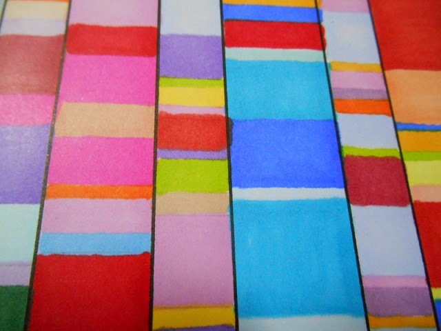
I started off by pencilling in rows on a piece of blank white card and then dividing each row into a series of random stripes. I then tipped out my huge box of Pro-Markers onto my craft table and started to colour using the fabric as my guide. Getting braver and braver, I then started just grabbing colours and making my own pallettes for each row. I resisted the temptation to "match" the colours and put colours together that I wouldn't normally select. You can see the result below:

When I had finished colouring, I defined the rows with a black fine-liner. As I was using Pro-Markers, there was a little bleeding which you can see in the close-ups.


So, having created my stripes, what was I going to do with them? The idea for a riotously coloured tag came to me. I die cut a tag from the coloured card and then embossed it through a diamond mask, which gave the effect of a quilted fabric. I then coloured a piece of card, using the wrinkle free distress method, using Picked Raspberry, Peacock Feathers, Squeezed Lemonade, Mowed Lawn, Shaded Lilac and Wild Honey and then cut the dragonfly, which was then embossed using the matching Folder. (Tim Holtz Layered Dragonfly Die by Sizzix).

Using some colourful scraps I die cut some Tattered Florals which I shaped and stacked to make a flower.

I added some hand-written words on coloured card and dyed some seam binding with the same distress colours I used for the dragonfly. I mixed this with some bright ribbons from my collection and this completed the tag.
I must admit that I was dubious as to whether this would work, but I'm very pleased with the overall effect. My only regret is that the photography has washed out a lot of the colour, making it look more stark than it is in real life - the original is "warmer" than the photo.
So, plenty of colour and not a hint of Walnut Stain in sight! I can't promise to make all my art so vibrant, but I will no longer shy away from using colour and mixing bright colours together.
I'd like to try this again using paint, as I think I could get better colouring and shade matching using paint, but I wasn't that brave today. The pro-markers are great but they do tend to be on the blue side of the spectrum and don't come out that warm, but on the plus side they are very easy to use.
Thanks so much for visiting and hope you enjoyed my flirtation with colour.
Keep Crafting!
Jean


